“What tax do I owe?” self-served through simplicity & AI
↗
in confidence rating after re-design (low sample size but unanimous direction)
2
calculation errors detected pre-launch, important for a feature SMBs trust with their money.
4×
prospective increase in tax engagement
For a business owner, “How much tax do I owe?” hangs over the whole year. Accountants can help once, but not in real time. That blind spot can be expensive: the IRS assessed a record $7B in underpayment penalties in 2023. For QuickBooks, the same quarterly rhythm that creates the anxiety is the opportunity to build year round trust & confidence around taxes.
2026 | 5 months | 10 research participants Team: 3 product managers, 1 senior designer, 1 content designer, 12 engineers & myself.
-
Originated the concept (the project was then transferred to another designer)
-
Stepped back in 2w before the first release to address scope expansion
-
Led launch user research for fast quality improvements
Cutting complexity & cognitive effort
After redesign
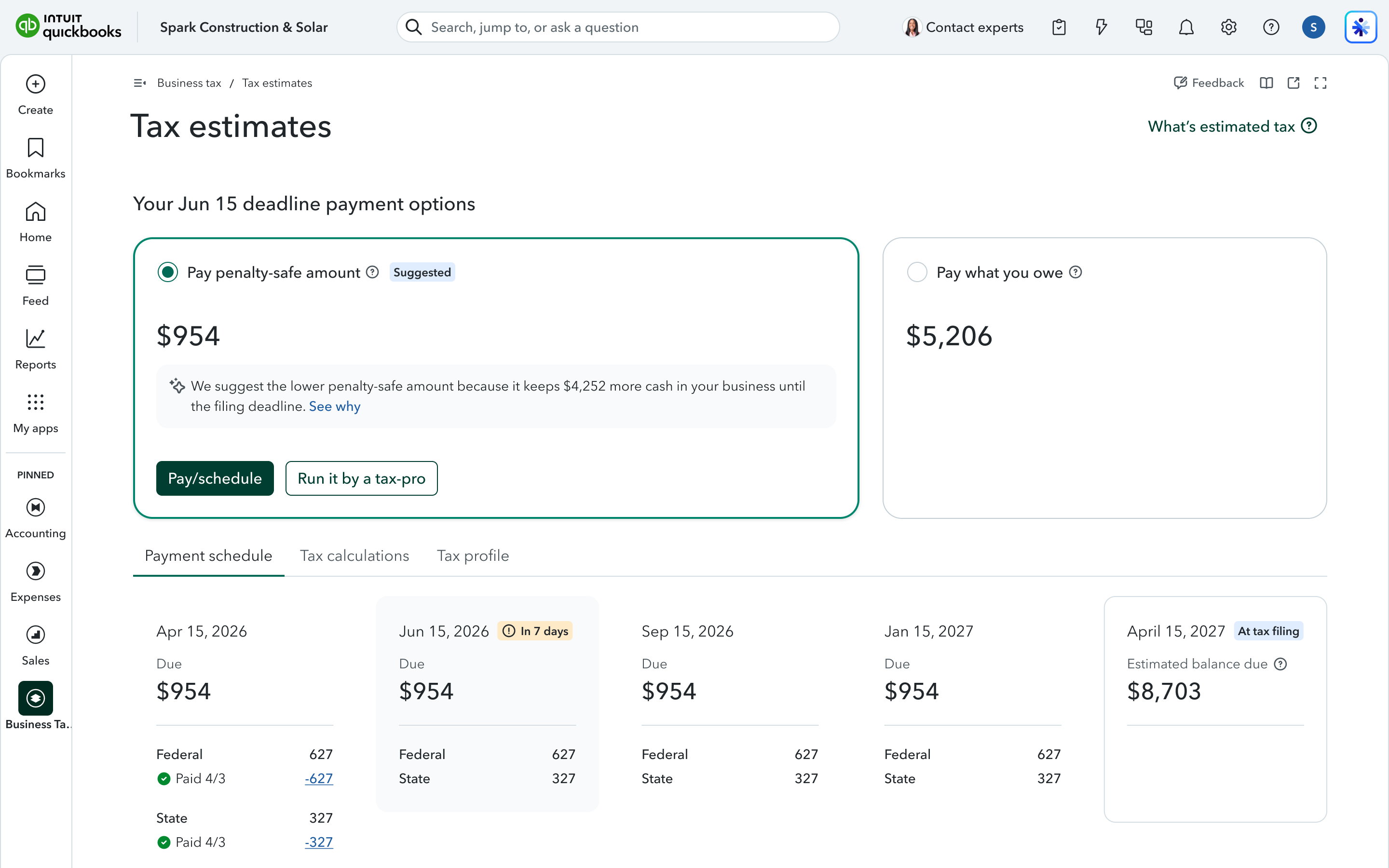
Before
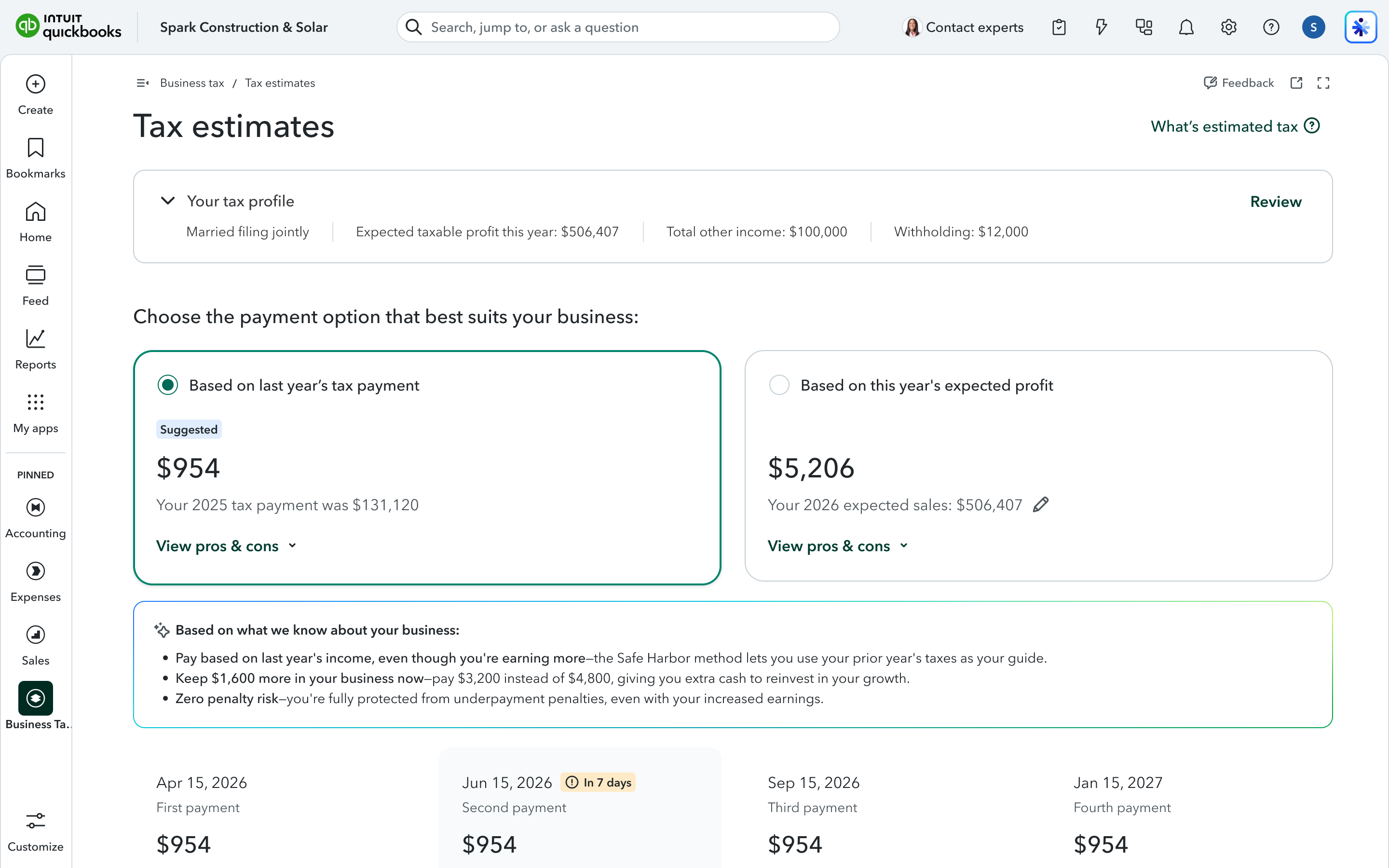
- 01
Labels focus on the outcome
“Pay penalty-safe amount” vs. “Pay what you owe” leads with outcome. “Based on last year's tax payment” vs. “Based on this year's expected profit” forced the user to reverse-engineer the consequence from the method.
- 02
Transparency at tax filing
I surfaced each choice's trade-off as a projected balance due on April 15. The decision carries its future with it.
- 03
The AI suggestion got consolidated
I gave the AI's suggested option clear visual primacy, so business owners aren't left to adjudicate two options on their own, nor look in various locations to integrate the various bits of information.
- 04
CTA front & centre, tabs absorb the density
With the progressive launch of features, the page became a stack of modular elements, disconnecting the information and pushing the CTA down the page. I integrated related primary information to support quick understanding & a clear path to action and I layered secondary information in tabs.